Media q2 from CreamCracker
Wednesday, 24 April 2013
Monday, 22 April 2013
Sunday, 21 April 2013
Media Essay: Q3
After writing our synopsis for our film, before any filming, we went out into Barnsley Town centre to interview a variety of people from different ages, genders and occupations. We asked them their age, occupation, favourite genre, would they recommend our film and would they either pay to watch it, watch it for free or not watch it at all. Here were the results:
1. 17 year old male student. Favourite genre: Action. Would watch the film for free but would not recommend it.
2. 17 year old male student. Favourite genre: Tarantino. Would watch the film for free and would recommend it.
3. 19 year old female sales assistant. Favourite genre: Comedy. Would pay to watch it and would recommend it.
4. 40 year old male police officer. Favourite genre: Urban drama, such as "Brasses off". Would watch it for free but would not recommend it.
After looking at this brief, preliminary study, we found out that roughly, teenaged, females who like comedy would like our film the best. However after finishing the film, we found out males liked it the most and could identify its genre and could relate it to existing films. Having said that, their favourite genres were mostly comedy.
The audience we had in mind at first when creating our film was the people who you see normally at cinemas; teenagers. Therefore we studied genres and other films that appeal to teenagers. In one of our surveys, 5 out of 9 replies said their favourite genre was comedy and one said action. This is why we thought it would be ideal to include some Tarantino traits within our film; he can use comedy but still make a film serious and realistic.
The
main moral of our film is to be yourself and the people who accept you for who
you are, are your truest friends and to not be someone you’re not by doing
things you wouldn’t normally do. This does not become apparent until the very
end. The shock of this is designed to be memorable, hence why it is only
obvious when Ella is killed. Throughout the film, it is a similar storyline to
that of Cinderella; the audience are already expecting a typical ending and a
typical moral. However life never goes according to fairytales, and with the
official genre of our film being an urban thriller in the style of Tarantino,
we wanted it to be as realistic as possible to help teenagers accept themselves
for who they are and realise that it’s not all about being socially accepted.
When
reading the feedback of our questionnaire, we discovered that a higher
percentage of younger viewers knew the genre and morals of the story than those
over the age of 35. This is probably due to social changes throughout society
over the decades; although some teenage traits are timeless, culture and fads
are constantly changing, therefore our film would be easily understand more by
people around a relative age to the characters in the film.
Media Essay: Q4
Regarding digital technology, I used
Final Edit for my film and radio trailer, Photoshop for my film poster and
google for my questionnaire.
I liked using Final Edit because it is
very detailed regarding the editing for continuity and rolling. The zoom in
options and magnet are very useful for continuity and the roll on tool is
useful for smooth match-on-action cutting. However, regarding effects, it was
very restricted. There aren’t many fonts or effects for text as I wanted to use
a similar font used for the introduction of Hugo Stiglitz; however it is not
within Final Edit. The magnet tool was useful for dragging slips together and
avoiding gaps and clips between scenes and cuts. Final Edit is also useful for
layering text and videos on top of one another. The layering feature is
limitless.
Final edit was also useful in helping me
create a radio trailer with its layering features and audio effects which I also
used within my film. There were many different effects such as echo and LPF’s
and HPF’s which I used to make people sound like they were speaking over the
phone. As radio trailers aren’t visual there needs to be plenty of dialogue so
the listeners have plenty of knowledge on what the film could be about as most
video trailers have no voice over dialogue at all. For this, I used AT&T Labs
text-to-speech website. Although there’s a limited variety of voices and they
aren’t exceptional quality regarding smoothness, there is no interference that
would occur with a microphone, no feedback and no background noise and is
therefore a clean voice over sound clear enough for anyone listening to the
radio to here comfortably. It is easy to use and easy to download safely and to drag onto your inventory within Final Edit.
Google was an excellent tool to use for
my questionnaire. With it being on line, it is simple to use and easy for
people to access and find. The spread sheet format is helpful to calculate your
results and answers and are able to see them clearly.
I used photoshop to create my film
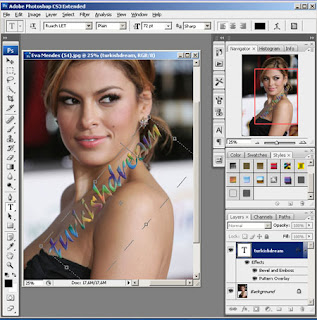
poster. This software is useful for editing faces on posters as it possesses
air-brush effects to smooth out pixelated images. It also has good layering
effects so that you can include many images onto your poster without sharp edges
or the poster looking too cluttered. It has unlimited effects and has photo
editing effects for individual photos (especially for people) as well as
mastering effects for an overall image.
We also used Microsoft Word to write up our scripts and used microscoft publisher to create our location assessments. Word was useful for scripts as it contains many diffeerent word layouts and is able to present it like a genuine script and is able to look professional. Publisher is more suitable for location risk assessments as you can place text anywhere on the page as well as photos as this software is commonly used for designing magazines.
Media Essay: Q1
Cinematography
Regarding continuity, we studied many other films to look for continuity errors and how to avoid them or correct them. Here, in Insidious, a male is sat downstairs with his shirt undone and a T shirt underneath. Then he’s seen running up stairs with his shirt fastened and a tie. This often occurs when a scene is being filmed over a period of days. To avoid this happening, we saved screen shots of our attire and wore the same clothes with the same hair/makeup on another day of filming.
Regarding continuity, we studied many other films to look for continuity errors and how to avoid them or correct them. Here, in Insidious, a male is sat downstairs with his shirt undone and a T shirt underneath. Then he’s seen running up stairs with his shirt fastened and a tie. This often occurs when a scene is being filmed over a period of days. To avoid this happening, we saved screen shots of our attire and wore the same clothes with the same hair/makeup on another day of filming.
These
scenes were filmed on different days
http://www.youtube.com/watch?v=mMHjWiMqgQs
We used a variety of continuity techniques to help break up the film slightly and make it more visually interesting such as match on action, shot reverse shot, 180 degree line and eyeline match.
Firstly, we used a lot of match on action throughout the film to make the film smoother and easy to watch. Here are a few examples of our match on actions:
For conversations between characters, we used the 180 degrees rule and shot reverse shot to show each character's reactions from the other's perspective and view towards them. To achieve a successfully effective shot-reverse-shot, you must abide by the 180 degree rule, whereby the camera must be over one character's left shoulder and the other's right, otherwise viewing becomes uncomfortable and the location and perspective becomes confusing and the audience wouldn't know where to look. Here are some examples of shot-reverse-shot whilst maintaining then 180 degree rule:
However in one scene, we had to break the 180 degree rule in the bedroom scene between the mother and Ella. The reason being because due to the limited space within the room it was physically impossible to obtain the 180 degree rule. However because the room was small and you could see the majority of the room from most angles, it wasn't hard to watch and wasn't as noticeable as it would have been in a larger environment with many different features:
Mise en sene
Regarding mise-en-scene, this was an easy process mainly due to our foundation genre being a modern fairy tale of Cinderella. Our Cinderella charatcer was the obivously named "Ella". In the traditional Cinderella story, she's covered in ash and wears old, torn clothes. However with it being a modern version of the story, people who dress like that now are depicted as a totally different charatcer, such as homeless people or tramps. Therefore we dressed Ella in an old hooded jumper with plain leggins. She has no makeup on and does nothing with her hair. As Ella, like Cinderella, is meant to be depicted as intelligent and responsible and more interested in working that scoialising, we made her look like she wanted to make a slight effort with the modern leggins and jewellery probably given to her by family, but lacked enough motivation to attempt to fit in. properly with trendy clothes and hair styles as well as makeup. We chose to give her a blue jumper as blue represents sadness and emotion. At the end of the film, she is still wearing a jumper but a coral pink one, which is a lively, happy and bright colour to reflect her new found confidence.
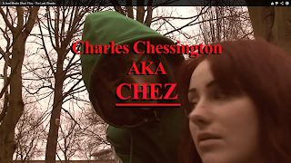
Chez is the villain in our story. Today amongst youths, the largest icon for hate and dislike are chavs, as they are commonly associated with vandalism, violence and verbal abuse and are disliked by most teenagers. Since the film is an urban thriller surrounding teenage society, we thought that making our villain a chav would me the most appropriate. We looked at what chavs typically look like, such as Devvo, who is a famous chav character on youtube. He typically wears addidas jumpers with a cheap T shirt underneath and either cinos or trackie bottoms. We also looked at how Devvo spoke, normally with taboo language whilst mumbling and not pronouncing words correctly, which we used to inspire our own "chav". Chavs are also depicted as being violent and are infamous for carrying knives and are associated with knife crime, which is why Chez is seen with a knife in his pocket ready to stab Seth as his weapon of choice. We purposely chose to give him a green jacket as green represents jealousy, which is Chez's motive for his actions (he is jealous of Seth's relationship with Ella who is his love interest).
http://www.youtube.com/watch?v=7RBelz8BgX0
We used a variety of continuity techniques to help break up the film slightly and make it more visually interesting such as match on action, shot reverse shot, 180 degree line and eyeline match.
Firstly, we used a lot of match on action throughout the film to make the film smoother and easy to watch. Here are a few examples of our match on actions:
However in one scene, we had to break the 180 degree rule in the bedroom scene between the mother and Ella. The reason being because due to the limited space within the room it was physically impossible to obtain the 180 degree rule. However because the room was small and you could see the majority of the room from most angles, it wasn't hard to watch and wasn't as noticeable as it would have been in a larger environment with many different features:
Mise en sene
Regarding mise-en-scene, this was an easy process mainly due to our foundation genre being a modern fairy tale of Cinderella. Our Cinderella charatcer was the obivously named "Ella". In the traditional Cinderella story, she's covered in ash and wears old, torn clothes. However with it being a modern version of the story, people who dress like that now are depicted as a totally different charatcer, such as homeless people or tramps. Therefore we dressed Ella in an old hooded jumper with plain leggins. She has no makeup on and does nothing with her hair. As Ella, like Cinderella, is meant to be depicted as intelligent and responsible and more interested in working that scoialising, we made her look like she wanted to make a slight effort with the modern leggins and jewellery probably given to her by family, but lacked enough motivation to attempt to fit in. properly with trendy clothes and hair styles as well as makeup. We chose to give her a blue jumper as blue represents sadness and emotion. At the end of the film, she is still wearing a jumper but a coral pink one, which is a lively, happy and bright colour to reflect her new found confidence.
Chez is the villain in our story. Today amongst youths, the largest icon for hate and dislike are chavs, as they are commonly associated with vandalism, violence and verbal abuse and are disliked by most teenagers. Since the film is an urban thriller surrounding teenage society, we thought that making our villain a chav would me the most appropriate. We looked at what chavs typically look like, such as Devvo, who is a famous chav character on youtube. He typically wears addidas jumpers with a cheap T shirt underneath and either cinos or trackie bottoms. We also looked at how Devvo spoke, normally with taboo language whilst mumbling and not pronouncing words correctly, which we used to inspire our own "chav". Chavs are also depicted as being violent and are infamous for carrying knives and are associated with knife crime, which is why Chez is seen with a knife in his pocket ready to stab Seth as his weapon of choice. We purposely chose to give him a green jacket as green represents jealousy, which is Chez's motive for his actions (he is jealous of Seth's relationship with Ella who is his love interest).
http://www.youtube.com/watch?v=7RBelz8BgX0
Next, we have Jessie and James. These are the bullies and the "evil step sisters" characters of the film who in the original story were shallow and only judged and cared about appearances and social status. Not only do we illustrate this through the script, but the characters are both wearing trendy, expensive and in-fashion clothes that are in date with today's teenagers including leather jackets (which are depicted as being expensive) but they are also black, to reflect the character's personalities and to show the audience that they are clearly antagonists. Jessie's dark, smokey makeup also helps represent this.
Lastly, we have Seth. Modern clothing amongst teens today is the "mosher" look with leather jackets, jeans and band T-shirts. People who wear this attire are normally pleasant and sociable and we wanted to make it seem at the beginning that any chance of Seth being interested in Ella would be hopeless to establish more shock at the end. Therefore we wanted him to look the opposite of Ella: fashionable, trendy and sociable.
The genre of our film was a modern
fairytale. Obviously for it to be modern, we have altered typical aspects to
make it appeal to our target audience, which is from 12 to 35 years of age, but
kept some traditional aspects to make it quirky and memorable, such as cliché
language and situations such as the villain fighting with the hero over a
woman.
Our film’s target market is men and
women aged between 15 and 30 as there is strong language as well as bloody
violence. The language was deliberate; typical fairytales are typically clichéd
and innocent, as they are not only intended for children, but are meant to
communicate some spiritual morals into the audience. Our storyline and
characters are similar to that of Cinderella, but to achieve our desired
reactions of surprise and shock from the audience, we used strong and modern
language amongst 15 to 30 year olds today. Our director influence was Quentin
Tarrantino who takes historic or older genres and makes them modern through
means of language, effects, non-diegetic music and titles. This technique is used
by Tarantino. The strong, unusual language seems misplaced in the film; however
should the situations in our film occur in real life, this sort of taboo
language would be used, which makes the film seem more realistic and believable
as well as shocking. Inspiration for this aspect comes from Inglourious
Basterds and Kill Bill in the following sequences:
In the Kill Bill scene, Beatrix is
seeking revenge on the woman in the door, a former assassin, who betrayed her.
During this scene, they call each other “bitch”. This is a very common, taboo
word and, again, wouldn’t be typically used in a dramatic scene such as this as
most directors would fill it more with emotion and depth with poetic dialect.
However, in a fight between two women with a bad past between each other in
reality, it would be the type of language used.
In Inglourious Basterds, the spies’ covers
have been blown by a Nazi officer
but is being held at gun-point by one of the
German spies. Typically, this
would be a dramatic, nail-biting scene, which
it is, up until the point where
Stiglitz says “say Auf Wiedersehen to your Nazi balls” This is not only
unexpected, but creates black humour which
will be memorable to the
audience. However, they are sat at a table
and are aiming their guns at each other discretely; the only effective place to
aim is at the genitals, thus being a realistic situation. Again, although not
expected in a typical war film, it would probably
be the sort of thing a Nazi-hating German
would say to a Nazi. This is a good
way of producing a shock factor whilst
maintaining realism.
Lastly, regarding editing, we used a
technique called Paralell editing used by Jonathon Demme in Silence of the
Lambs whereby the FBI are knocking on what appears to be Buffalo Bill’s front
door and when Buffalo Bill goes to open it, Clarice is there, and it turns out
the FBI have gone to the wrong house. This is to create shock and suspension.
We do it with Chez looking at his phone cross
cutting with a fair of feet in a solarized effect. I did this so that not only
would the audience not know who it was, but to foreshadow danger which would
include a knife, Chez and another character. The solarize was to symbolize that
we would have no inclination as to who this unfortunate would be, as is
revealed later as Seth and Chez fight, you assume it would be Seth, when in
fact it was Ella who got stabbed with the knife.
Back to Tarantino, we have used inspiration
from the use of titles. We gave Chez a title to indicate his importance and
foreshadow his influence on the film’s events. Tarantino uses this technique in
Inglourious Basterds and Kill Bill. We used the font and nick-name from Kill
Bill where Tarantino introduces Elle, who is a future antagonist and plays a
similar role, influence wise, as Chez. The music, however, I have used from
Inglourious Basterds’ Hugo Stiglitz’s introduction. The strong, electric guitar
sounds powerful, and is used to make Stiglitz seem powerful. Lastly, with
inspiration from the Stiglitz clip, we filmed it so you do not see Chez’s face
until he is at a close up over Ella’s shoulder which is at the same time of his
“introduction”. This is also to make him seem powerful and mysterious. Although
Chez isn’t physically powerful, he has full control over the situations
throughout the movie through his actions and thinking. Whilst on the subject of
music, when the title “The Last Shards” appears, also in the style of Tarantino
in “times new roman” to match Chez’s title, this is during the bullying scene.
The music is in a minor chord, which is associated with sadness. It is also in the
style of disco/rock type of music. This is also used in Tarantino’s Kill Bill
scene where The Bride is fighting O-Ren during a samurai sword fight. The music
is similar to represent old, Japanese martial art video game music but it also
makes the audience focus more on the elegance and power beheld by the two
fighters rather than the emotions purged into it; we wanted to have the same
effect. The music we used, however, was more modern sounding to represent youth
culture, of which music is a big part of.
An effect idea we did entirely on our own was
Ella’s death scene where there is a colour de-saturation and an echo. When
people die, their senses deteriorate gradually one at a time. Hearing is the
last to stop working which is why when the scene goes black you can faintly
hear James calling an ambulance. We also shot this from Ella’s point of view to
make it more realistic and for a variety of cinematography. When the camera was
facing Ella, we kept the de-saturation to show her being more pale and dying
more effectively. Lastly, we made some fake blood using a recipe from a youtube
video using edible ingredients. We decided to make our own edible blood because
when people get stabbed in the stomach, they start regurgitating blood,
therefore to make it seem more realistic and serious, we decided to have blood
coming from Ella’s mouth, thus having edible blood was a necessity.
Another Tarantino inspired shot is when James
drops his can onto the floor when he sees Ella wounded, whilst Ella is brushing her teeth as it zooms in on the tooth paste and when Chez accidently
picks up a banana instead of a knife and throws it down. This is to just cut
the scene up a bit and add a small amount of humour. It is also very weird and
makes the audience wonder why the camera has specifically shot that. Tarantino
does it in Inglourious Bastards. Here, he unnecessarily has an extreme close-up
on the cream being dished and put onto the pudding.
http://www.youtube.com/watch?v=q5z1y2jOofQ
Lastly, with our film being a modern fairy tale, we have tried to make that apparent through our characters; the heroin is a young, bright girl with hand-me-downs, put down by two of her peers, has a love interest and a fairy god mother character who boosts her confidence. However, taken from Tarantino styles, we have an unexpected ending where instead of living happily together after admitting feelings, the heroin is killed. The film’s main slogan “Get busy living or get busy dying” is not only our message and moral, but we’ve taken it from the film The Shawshank Redemption, a classic thriller. We did this because we didn’t want the film to be too much of a comedy/parody and wanted it to be taken seriously slightly to get our message across to the audience which is intended to be socially educational as well as morally. Regarding the theory of Utopian Solutions, this film would appeal to people who feel empathy towards Ella. This film contains knowledge, empathy or modern teenagers, community and romance; these aspects are what common teenage lives revolve around as they grow and discover more adult aspects of life which are new to them. Watching our film would satisfy a teenager’s needs and curiosity about such things and would put into perspective/or confirm the reality of teenage life. In comparison with our studies, most people who would watch and rate our film are people aged between 13-21 year old students.
Lastly, with our film being a modern fairy tale, we have tried to make that apparent through our characters; the heroin is a young, bright girl with hand-me-downs, put down by two of her peers, has a love interest and a fairy god mother character who boosts her confidence. However, taken from Tarantino styles, we have an unexpected ending where instead of living happily together after admitting feelings, the heroin is killed. The film’s main slogan “Get busy living or get busy dying” is not only our message and moral, but we’ve taken it from the film The Shawshank Redemption, a classic thriller. We did this because we didn’t want the film to be too much of a comedy/parody and wanted it to be taken seriously slightly to get our message across to the audience which is intended to be socially educational as well as morally. Regarding the theory of Utopian Solutions, this film would appeal to people who feel empathy towards Ella. This film contains knowledge, empathy or modern teenagers, community and romance; these aspects are what common teenage lives revolve around as they grow and discover more adult aspects of life which are new to them. Watching our film would satisfy a teenager’s needs and curiosity about such things and would put into perspective/or confirm the reality of teenage life. In comparison with our studies, most people who would watch and rate our film are people aged between 13-21 year old students.
Friday, 19 April 2013
Evaluation Jake.B
Critical Evaluation
1. In what ways does the media product use, develop or challenge forms and conventions of real media products?
In terms of continuity editing, my group was very cautious not to leave any errors in our film. We noticed that in some A2 and AS short films from previous years have made little continuity errors which made their films look slightly unprofessional. As well as student films, we also noticed that full 90 minute films such as ‘Insidious’ also have major continuity errors.
(11 seconds in to the clip)
(14 seconds later)
As a brief look we can see that the father has his shirt unbuttoned and he isn’t wearing a tie, then in the second clip we can see that he has his shirt buttoned up and tucked in to his trousers and he is also shown wearing a black tie. This is the main type of continuity error that we definitely want to avoid because it looks very unprofessional and lazy.
Keeping our film continuous was sometimes quite challenging. For example, maintaining the 180 degree rule was sometimes very difficult because we had a lot of ‘shot reverse shots’ between Becky and Nicole and also Becky and Joe, which was quite confusing at times. As well as this, we sometimes found it hard to keep it continuous because we filmed half the park scene one day and the other half on a separate day, which was a challenge to keep props and clothing the same as well as the weather which was very unpredictable at that time.
Another minor issue we had with the park scene was the eye line matches between Becky and Nicole as when the camera is over Nicole’s shoulder Becky looks up at a different angle to the next close up of Becky which we had to carefully cut and edit to make them fit together well.
Our film was originally going to be a modern adaptation of the fairy tale ‘Cinderella’, but as we progressed with filming our media product, we took a step further and gave our film a more suspenseful and twisting ending which has a very emotional scene where our protagonist ‘Becky’ (Cinderella) is killed. This is a deliberate challenge of the fairy tale genre which we think is effective because it is unexpected and it will entertain the audience more effectively than if we simply made a modern version of Cinderella and stuck to the story line and character development.
We haven’t just adapted a simple fairy tale, we have also hinted at another film ‘Inglorious Basterds’ by using similar text from when Quentin Tarentino introduces some of the main characters in his epic new take on WW2. We took inspiration from the scene where ‘Hugo Stiglitz’ is introduced with big, bold orange/yellow text alongside with non-diegetic electric guitar ambient music which makes the introduction very unusual, but eye catchy at the same time. In our film we used red text to symbolise danger and evil which fit well with our character Chez.
We tried to entertain our target audience by using suspenseful techniques such as very dramatic and intense non diegetic music which enhances the atmospheric mood, such as in the scene where Chez is shown picking up the knife and walking towards the door where we all think something dramatic is going to unfold. Also Chez is in love with our protagonist Elle and he is shown looking at her picture on his phone and the tense music added shows how emotionally attached Chez is to Elle. This is a theory used by Richard Dyer which is called the ‘Utopian Solution’ where ‘Experiencing of emotion’ is directly shown, which is relevant here because Chez is emotionally controlled by Elle. We are sure that the audience will react to this scene because of its high intensity which I personally think is key to people enjoying a film when used correctly.
If our film had to be compared with any other film it would
be ‘Inglorious Basterds’ which I have already mentioned. Our film uses a lot of
dramatic sequences where our characters are in danger or are in potential
danger, such as where Elle’s feet are shown walking towards the door which Chez
is suspected to be opening with a knife at hand. The tense build up could be
compared to the scene in Quentin Tarentino’s film where Col. Hans Landa is
suspecting that Perrier LaPadite is hiding Jews in his farm and because the
audience know that he is hiding Jews makes the scene very suspenseful as we
feel a connection with the Jewish family and we imagine ourselves in their
position, knowing that they about to be caught.
(3:10-3:47)
http://www.youtube.com/watch?v=1_0AE8Qst6s (1:58-3:50 -) Inglorious Basterds
Another useful part of Inglorious Basterds is the
soundtrack, which doesn’t really fit well with the context of the film which is
violent and sometimes horrific. We used this idea in our film too as the final
scene is enhanced with the same music used in the WW2 film, but composed by
Becky which really gave a very tragic atmospheric ending to our short film.
(Look at 5:45 in our film)
(1:40 -)
2. How effective is the combination of your main product and the ancillary texts?
3.What have you learned from your audience feedback?
4. How did you use new media technologies in the construction and research, planning and evaluation stages?
During our research and planning we used multiple different platforms of new and useful technologies. We used many different internet sites to give us good ideas and inspiration to add to our production. YouTube was our main research tool to give us good ideas and examples of films with similar genres and also videos that taught us useful things such as embedding and sharing. We also found videos that helped us with one of our most crucial props… ‘How to make fake blood’ which is self-explanatory. YouTube was a crucial part of our research and planning because it is the only reliable multinational site where millions of videos have been uploaded; also we needed it to upload our film and radio trailer so others could see them and give us feedback.

We also used modern technologies such as ‘Facebook Messenger’ and simple mobile texting to communicate with each other. For example we used Facebook messenger to send a group message to ask our actors when they’d be available to film.
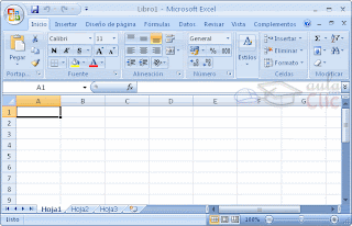
Nicole used Microsoft Excel to create some pie charts that reflected our
audience research results. We found this to be useful because it made our
results visually clearer and interesting to analyse.
Some of the sites we used where IMDb and the BBFC official websites which
helped us find film certificates, genres, actors, film gross and many other
interesting factors which aided our research and planning development.
Obviously Google Chrome was our primary search engine we used because of its
quick page loading and easy accessibility. As well as this Google has a feature called ‘Maps’ which was useful for
us to map out where to film and also get images of where our filming would take
place for our recce sheet.
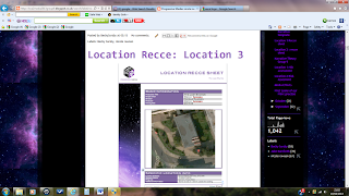
We used Google Blogger to upload our data, research and film to show to
the world. It is a great site which is free and very easy to use. Also Prezi
was another fantastic free site which helped each of us in our group create a
3D presentation for our evaluation. I found the site really useful as I can access
it any time and edit my presentation if I choose to.
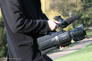
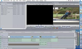
The editing software we used was Final Cut Pro, we accessed this on the Apple Mac’s that Barnsley College provided us with. We were familiar with this because we used it last year and it is a very simple program to use. We used features on it to help us cut, fade, colour correct, wire frame and change the audio settings.
Even though our project depended on technology, there were many instances where
this amazing technology had let us down. Photoshop was hard to use, Final Cut
sometimes struggled to load or save, the camera ran out of battery power a
couple of times and also many human errors massively affected our production such as taping over film we needed
and forgetting the tape which sometimes wasted 3 hours of our media lesson. To
overcome problems like this we had to try and backup data somehow, whether we
had to use a backup tape, multiple USB’s and even extra batteries for the camera!
We had to be prepared for anything.
We were able to use the internet to its full potential whilst completing
our media project; we were able to take inspiration from other films, logo’s,
posters and editing, particularly from the work of Quentin Tarantino, which we
massively mirrored into our film.
Subscribe to:
Comments (Atom)


